01 The name
Get this one right everywhere — posts, slides, captions, sign-ups, venue signage. It's the most common slip.
Spelling & capitalization
- lunatechs — lowercase is always fine (it's our default in logos and casual use)
- Lunatechs — title case is optional, for sentence starts or formal copy
- No camelCase —
LunaTechs(the capital T reads as "TECH in your face") - No mid-word caps of any kind —
LUNAtechs,lunaTechs
Plural by default — we're a community
Lunatechs is a community, so the name is plural. The group, the brand, the chapter — all "Lunatechs."
- "Join Lunatechs." / "Lunatechs is hosting a night."
- One member? "a Lunatech" is fine — singular for a single person.
- Many members? "Lunatechs" (e.g. "200 Lunatechs showed up").
- Never call the community/brand singular —
"Join Lunatech","Lunatech is hosting" - Don't drop the s on the org name to sound like a company.
What to call members
- One member → a Lunatech. The crew → Lunatechs.
- Playful & affectionate → tech lunatics — straight from the tagline, "Find your fellow tech lunatics."
- Never call anyone just
"a lunatic"on its own — it's always tech lunatics, or Lunatech(s).
02 Logos & icons
One family of marks, each with a job. Pick the one that fits the space — don't stretch, recolor, or re-font any of them.
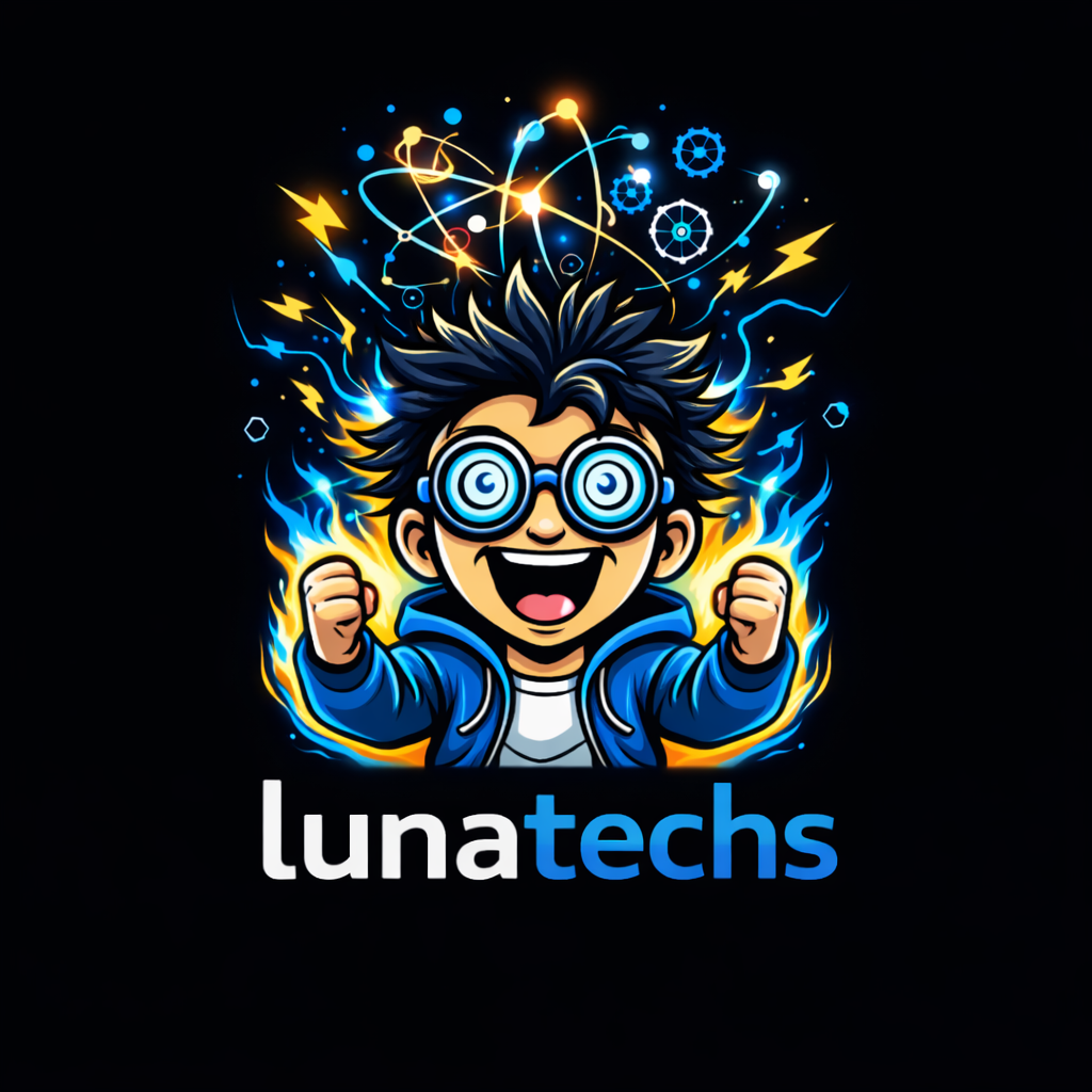


lunatechs-lockup-square-dark.png.
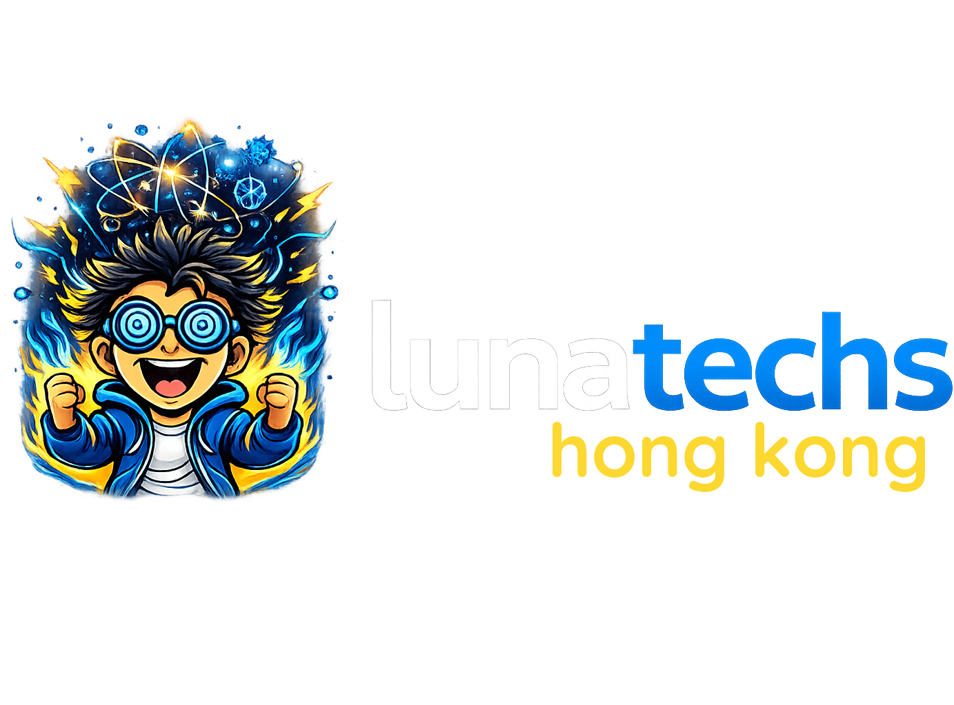

- Keep the wordmark lowercase; give every mark clear space.
- Use the light/2-tone versions on dark backgrounds.
- Match the mark to the space — icon when small, lockup when wide.
- Don't recolor, stretch, rotate, or add effects.
- Don't re-typeset the wordmark in another font.
- Don't crop the emblem or separate the mascot from its burst.
03 The two mascots
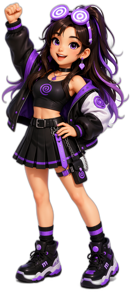
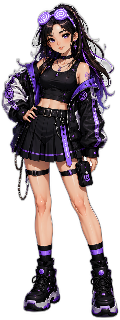
We have two. The guy is the default, paired with the core blue/gold palette. The girl is her own character with her own Lavender palette. Each comes in 2D anime and 3D CG (same style), plus a head-icon form.
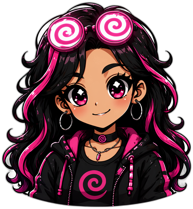
- Default to the guy + core palette for most brand moments.
- Bring in the girl for her own moments — and switch to the Lavender palette when you do.
- Keep her white-swirl glasses up on her head — that's her signature.
- Don't put the girl on the blue/gold palette, or the guy on lavender.
- Don't redesign or re-pose the mascots — use the official asset set.
04 Colors
Blue is the brand, gold is the spark, ink is the ground. This is the core palette — use it everywhere by default.
Use this only when you're featuring Lunatechs Girl. Everywhere else, default to the core blue/gold.
05 Voice
Curious, technical, direct. High-signal, low-fluff. We're a room full of people who love tech — write like one of them, not a brochure.
- Punchy and grounded. Lead with the point.
- Specific over abstract; show the real thing.
- Action-oriented — "tech with us," come build.
- No dramatic/cinematic copy — skip "the kind of space that…", stacked sensory lines.
- No hype, buzzword stuffing, or gatekeeping.
- Not "AI-only" — we're a tech-enthusiast community.
06 Imagery
- Real crowd photos from events — people, energy, the room.
- Lead with the mascots and the official marks as the brand signature.
- Name cities plainly: "Hong Kong," "Singapore," "Los Angeles."
- No moon / lunar imagery —
🌙. "Luna" is not a moon reference. - No lightning bolts —
⚡. Not part of the identity; the energy comes from the mascot, the spiral and the colour. - No country flags on cities/chapters.
- No generic stock-AI art (glowing brains, robots).